I was contracted to do a logo and then, ultimately, packaging design and brand identity for Pueblo Coffee Co. in Springville, Utah. In the original meeting, the owner had mentioned how in the middle of their Pueblo back home in Mexico, there was a Gazebo that they wanted to draw inspiration from and that their home in Mexico was surrounded by a mountain that was cherished by the indigenous people there which ultimately he wanted on the packaging of his labels for his coffee bags.
The Original Inspiration for the Pueblo logo comes from the kiosks that can be found at the center of many Mexican communities. This could be said to be the center of somebodies Pueblo and that rang true for the owner of Pueblo Coffee Co so we decided to go ahead and create a logo based on a Mexican kiosk.
In the end, the final logo I designed was a simple abstract logo that can be read and legible in small or large sizes of a kiosk. The typeface chosen was a simple san serif hand-drawn font that was bought through KernClub otf, and it is a nonlicensed free-use font even for commercial use, which was perfect for the fun urban style I was going for. Ultimately, the logo and all my packaging designs were shelved, and the owner went a different route with another designer who created a more realistic and heavy logo for them.
For the first-ever batches of Pueblo Coffee co, my label designs were used and I created a fun playful design using a mountain on the label, which symbolized a connection with Utah and the Pueblo where the owner was from. I also created a color system for every coffee bean designating them from their country of origin. Overall 6 different label designs were used and circulated. I also took the Product photos which were then posted to Instagram but have since been taken down due to the redesign.
Original Mockup.
Complete Label Design
Created in InDesign and Illustrator following a grid pattern was meant to be written on to print simpler labels that were flexible for use
Brunch House Collaboration Label
When Pueblo started gaining traction and collaborating with other local businesses, such as the Brunch House in Provo, I was tasked with creating a collaborative label design using the Brunch House logo in the Pueblo style. Since the Brunch house had a very monochromatic feeling, I decided to add a monochromatic block gradient design and add Pueblo assets. Note: I did not design the Brunch House Logo
Social Media photo materials
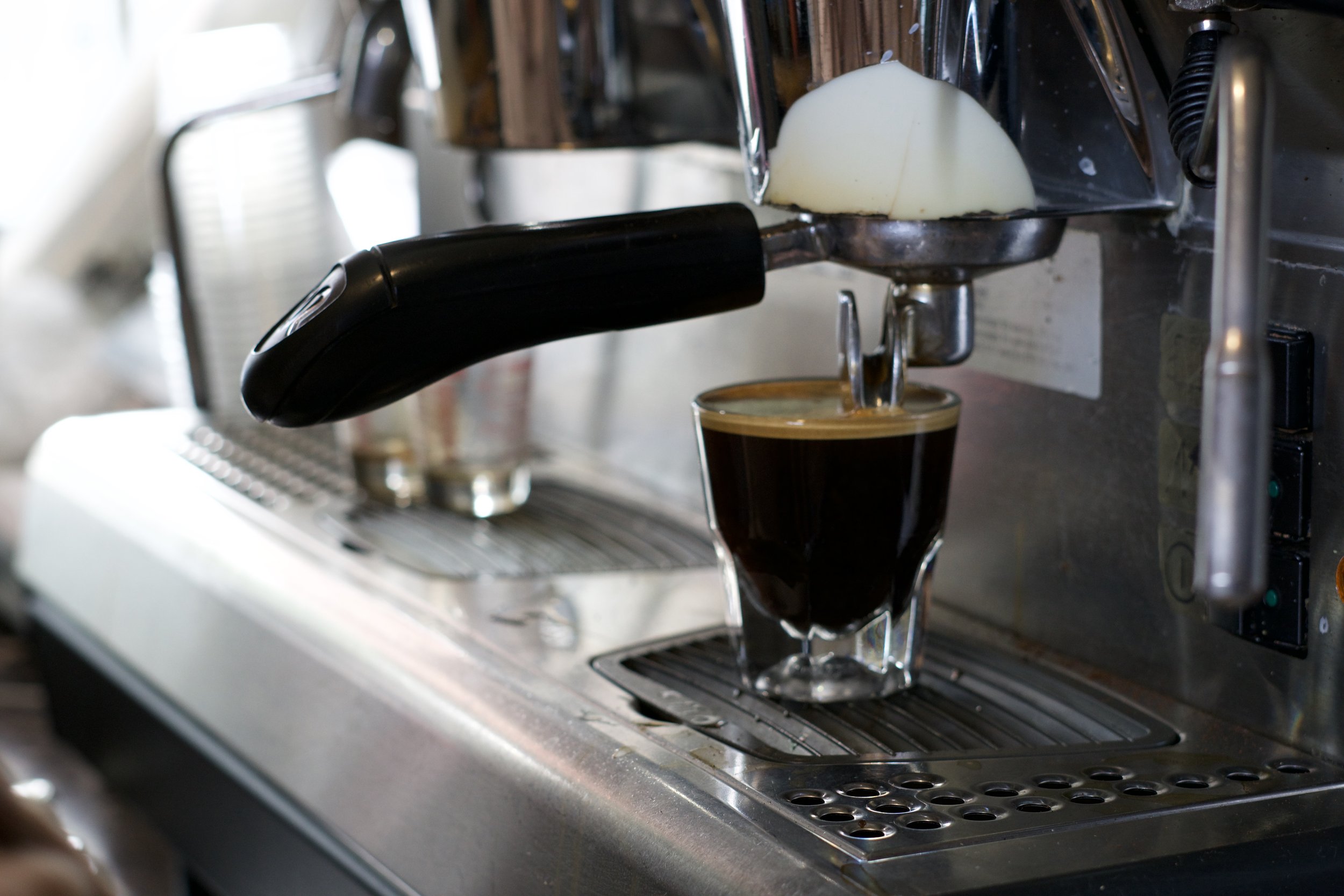
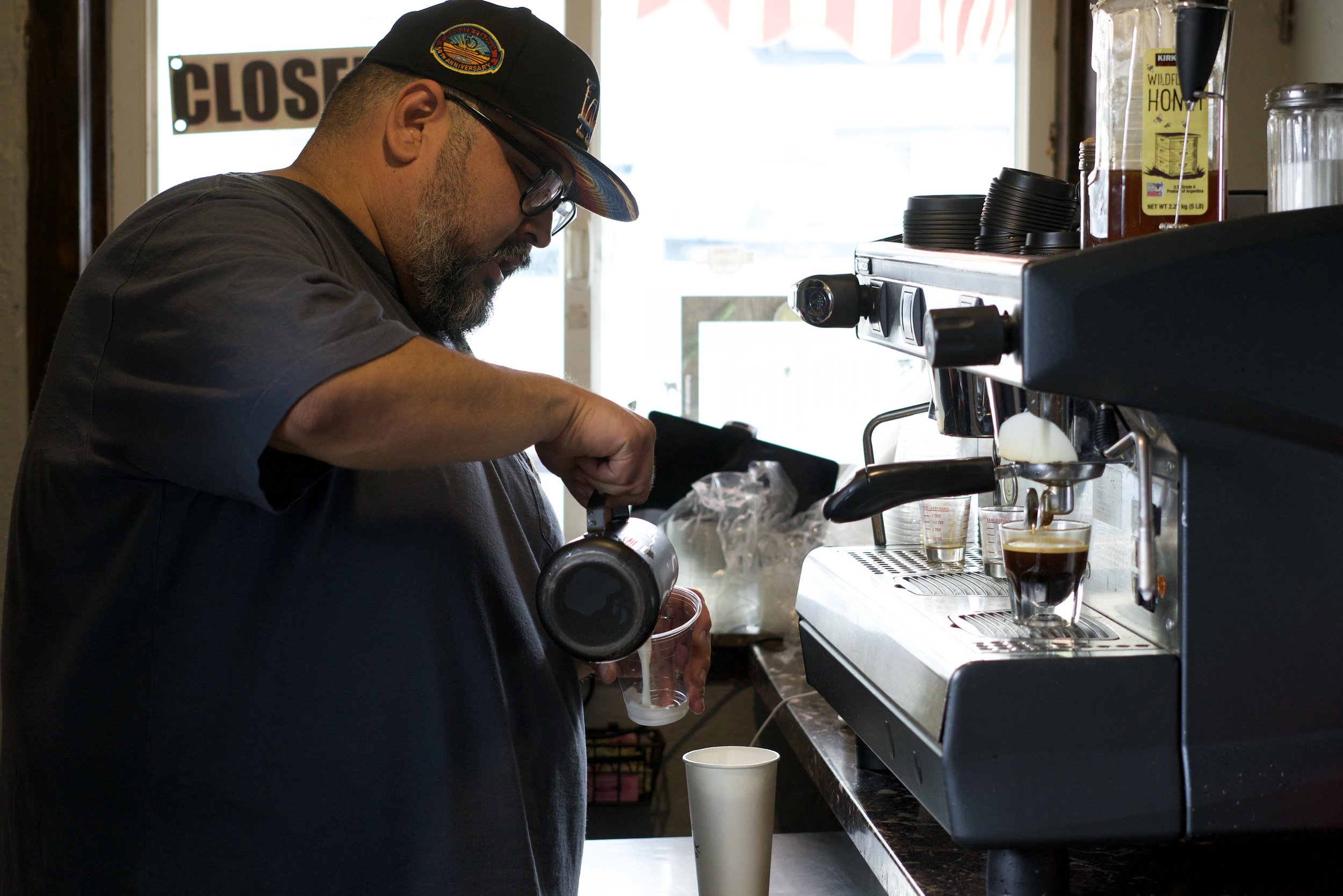
Since I was taking the product photos I was also tasked with taking promotional photos of the shop where the beans were being roasted locally here are some of those images


